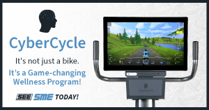
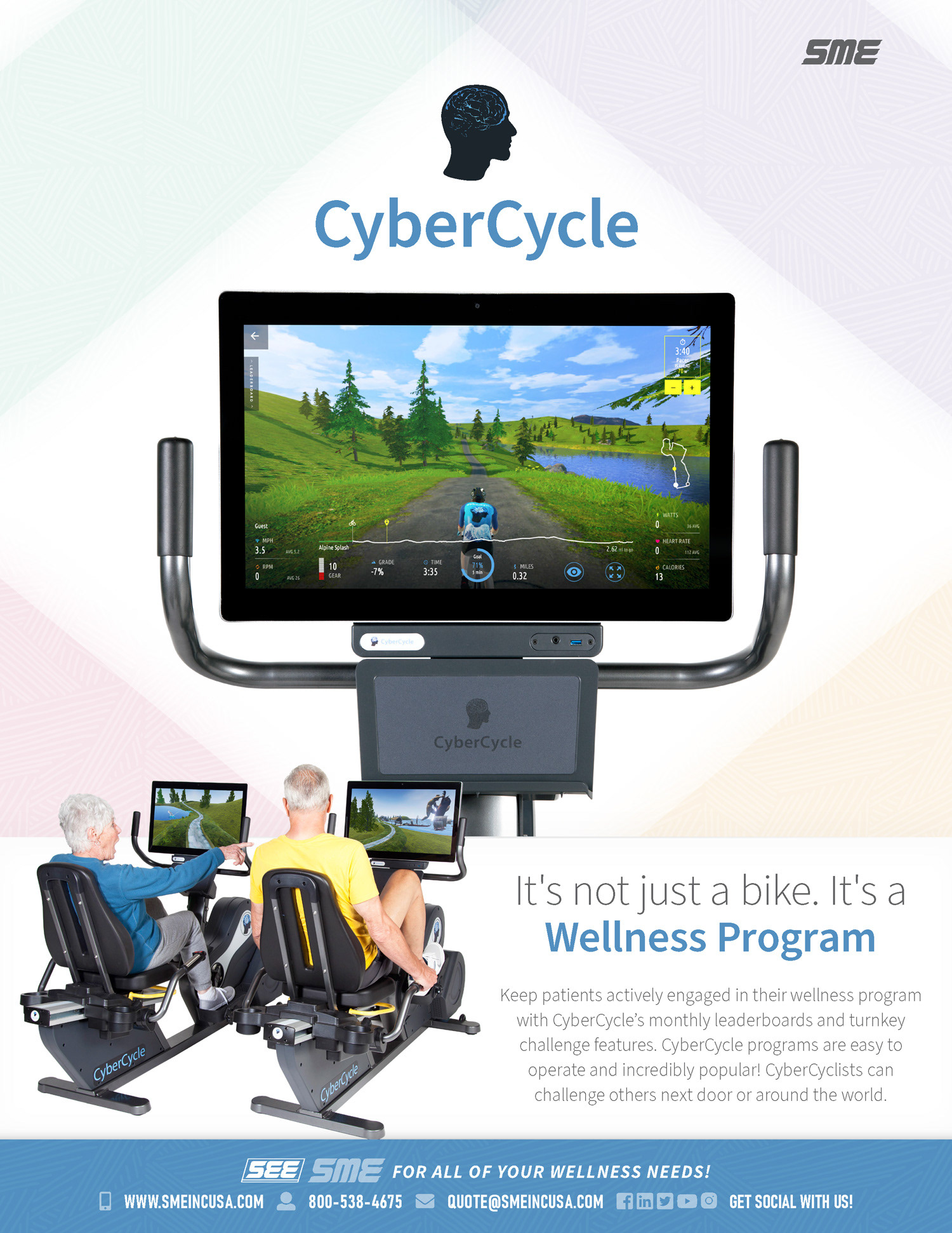
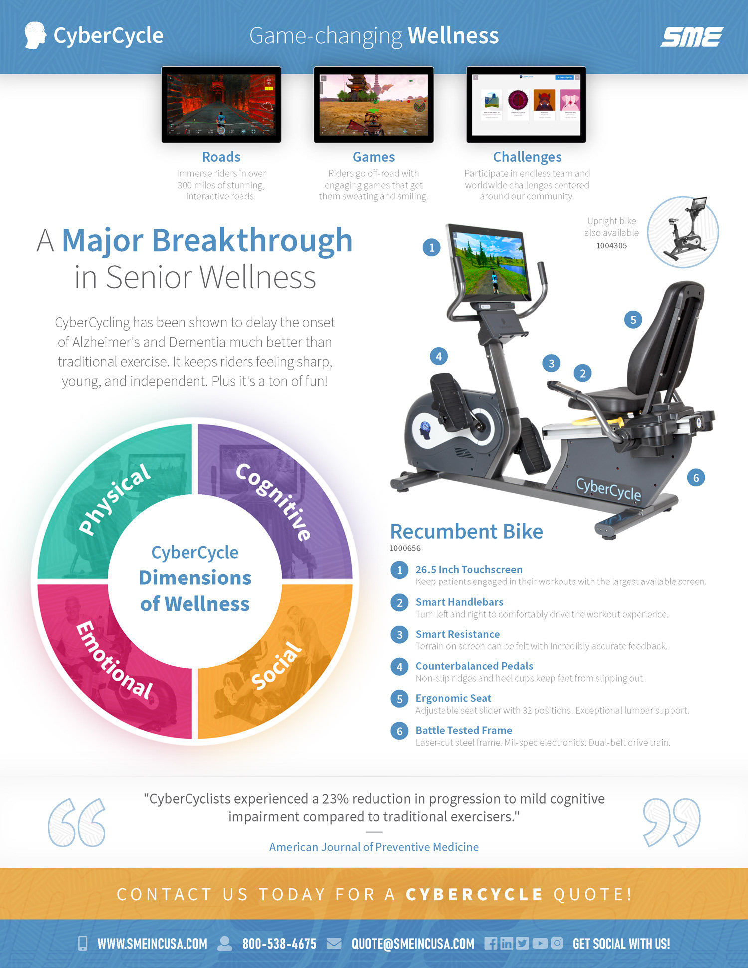
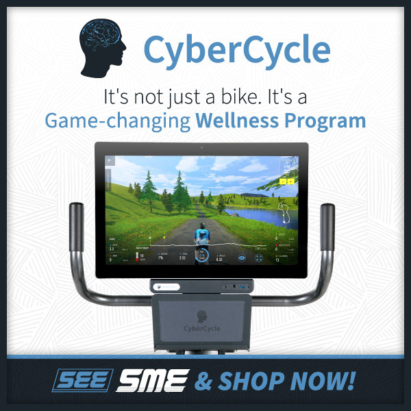
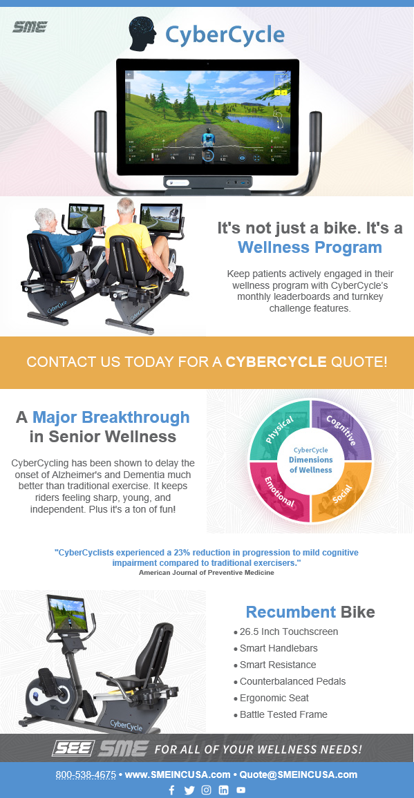
I was very excited from the start to promote CyberCycle. The idea of gamification is something I'm a huge fan of. While their product photography was seemingly endless, their branding art was very limited. For the cover, I took inspiration from their color wheel that I laid out on the back side of the flyer. That wheel was originally pictured on their website with just four solid colors. I was tasked with condensing their website down - with a focus on a single one of their machines - to an easily digestible promotional flyer for distribution to our clients.
Art for Weekly Social Media Posts and AdRoll

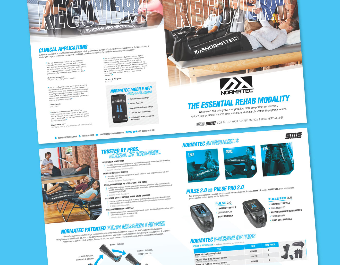
Art for Email Blast
Art for Company Email Signatures